How To Interpret Mobility & Footfall Data To Improve Decision Making In Your Sector – PLUS Much More!
Contents
Introduction
In recent years mobility data and footfall data has exploded. With massive corporations like Google and Apple the prevalence of mobility data has rocketed up into the stratosphere.
However, whether you realise you’re using mobility data is a different question! As technology continues to advance at an incredible rate the accuracy and variety of mobility data available to people and organisations has shot up. However, what actually is mobility data? Where does it come from and how can you benefit from it?
Also, how does it differ from location data, and how does it differ from traditional footfall data and people counting? Well these are just a few of the questions about mobility data we’re going to cover in this ultimate guide to mobility and footfall data!
Continue reading to learn all you need to know to reap the benefits of mobility data, whether you’re working in local government, real-estate, retail or even in finance. Mobility data can really improve your decision making, no matter what industry or sector you find yourself in.
And as a bonus we’ll offer up some of our favourite tools for visualising and presenting mobility data to decision makers and key organisation individuals. So, without further ado, let’s dive right in!
Get To Grips With All Things Mobility & Footfall Data
What Is Mobility Data
The very first thing we need to establish is; ‘what exactly is mobility data’? Mobility data is a record of how populations and even machines exist and interact with the physical world around them. There are many expressions of mobility data, including footfall, catchment areas, dwell-time analysis and visits to different types of place. Mobility data are the charts, graphs and statistics that help professionals understand the trends that shape the real world around us. The process of arriving at this information is rather complex. The term mobility data does not refer to any one type of raw source data, but encompasses a wide range of possible underlying measurements and data collection methods.
Mobility data has in fact been around for a very long time. For decades, professionals working in retail, real-estate and government have been familiar with types of mobility data including footfall, origin-destination matrices and catchment area studies. What’s changed recently is that new technologies have enabled new qualities that make mobility data more useful and ever more relevant. Principally, these innovations allow for:
- Instantaneous data collection
- Increased frequency of measurement
- Mobility analysis unbounded by time and geography
We’ll delve into each of these different factors throughout our guide and explain their importance and the role they play in mobility data. There are endless current and potential sources of mobility data, but all of them in one way or another talk about the same thing – how people and things interact with the real world around us.
These include:
- Data from mobile networks
- Data from CCTV, WiFi networks, beam counters and other physical solutions
- Data from mobile devices and mobile apps
- Data from transport operators and haulage firms
- Data from satellites
- Data from surveys carried out
Again, we’ll delve into these in detail later – but if you’re looking for a quick answer to understanding mobility data, then it’s important to be aware of them and how they affect mobility data you might end up using. But by the time you actually lay your hands on any mobility data product, you can expect the component parts – whatever they are – to have been processed into the charts, graphs and other statistical forms that make it ready for analysis! Now that’s out of the way and we have a better understanding of what mobility data actually is, let’s turn our attention to the pros and cons of mobility data.
Pros Of Mobility Data
There are potentially limitless possibilities and benefits of mobility data, but for now we’re going to address and share some of the most notable pros that might interest you. Without doubt the most powerful use of mobility data is to help businesses improve decision making. By providing organisations with accurate real time mobility data, professionals are in a position to make informed, evidence-based decisions.
This ultimately means you have access to all these benefits:
1. Measure footfall
The main overriding benefit of mobility data is that it allows you to understand with a high level of certainty where people go in the real world. This might also help you to understand why they are visiting places and identify commercial, planning, investment or marketing opportunities.
2. Uncover trends
The power of data is that it makes it easy to identify trends and make data driven decisions. Allowing you to understand how mobility patterns change in response to weather, attractions and seasonal trends.
3. Seize opportunities
Mobility data allows you to jump on and seize opportunities which traditionally might have been a bit of a gamble. Mobility data allows organisations to quantify local market sizes through catchment areas and footfall metrics. Therefore helping you seize unique business or marketing opportunities based on concrete data. This hugely reduces the risks normally associated with similar decision-making.
4. Know your market
Another fascinating benefit of mobility data is the ability to discover the optimal match between volume and value of visits to an area and truly understand your market capacity and consumer spending power.
5. Forecast the future
Having a solid data driven understanding of historical movement and access to current real time mobility data puts you in a powerful position to forecast the future and access revenue prediction models of retail entities.
6. Benchmark performance
You can utilise mobility data to compare places and real-world assets with peers and competitors to determine how your business is performing.
7. Provide human context
Another great benefit of mobility data is that it allows you to add human context to other data sets and data pools to understand the true nature of data and how human mobility is having an effect. We’ll cover this in more detail in a later chapter, but the power of combining mobility data with demographic, census and other data – like spend – is invaluable.
8. Get insights fast
Unlike traditional people counting and manually-captured footfall data, modern mobility data allows you to get insights lightning quick. With real time data available you can make quick decisions, instead of having to wait for data to be manually collected as it’s already available through the use of device measurement.
Cons Of Mobility Data
It’s fair to say that with advances in technology and the resulting boom in the variety and availability of different data sources, the positive qualities of modern mobility data – speed, on-demand access, detail and cost – are balanced by unknowns that the industry is getting to grips with. Principally, it’s hard to know whether the statistical information that mobility data providers offer is an accurate reflection of real life or not.
There are so many factors that make mobility data collection and processing a challenge. What or which combinations of data are being used in the first place? How frequent and fair is that data – does it suffer from biases, either known or unknown? There are many ways that mobility data providers seek to verify the accuracy of their data, but often the best way is simply to test it against external, authoritative statistics and see how closely they match.
But even that can be difficult. Often there are no direct comparisons that can be made to existing sources of fact – such as conventional survey data and statistics from authorities such as the US Census Bureau or the ONS. And given the limitations of each different way to measure different kinds of mobility, who’s to know whether the accepted history was ever in itself accurate either? Now we’ve dealt with the pros and cons of mobility data, let’s look at some real world use cases for it.
Uses Of Mobility Data
No matter what sector or industry you are in, there’s bound to be an applicable use case for your organisation. Let’s start off by looking at the following uses and see if we can help you discover how mobility data might improve your decision making. These are just a high level take on mobility data use cases. We’ll dive into these in much more detail in chapter four and teach you how to get the most benefits out of it. To make these uses easier to identify and understand we’ve categorised them broadly based on sector.
Local Government
- Economic development
- Measure daily footfall change
- Attract the right visitors
- Understand how visitors use your city centres (dwell, density & frequency)
- Benchmarking town centres with others
- Learning where people come from (locals, or is it a destination?)
- Improving the access, facilities or layout of spaces
- Transport management
- Learning how traffic flows through centres
- Finding ways to ease congestion
- Planning and building better transport links
Retail & Real Estate
- Retail site selection
- Find addressable market size
- Qualify potential customers
- Shortlist candidate locations
- Site performance benchmarking
- Finding the footfall potential around a site
- Using sales data to benchmark site performance
Financial Investors
- Quantitative analysts and investors
- Macro and micro investment research
- Accurately predicting sales performance
What Is Footfall Data
We’ve spoken a lot about mobility data, but what about footfall data? What is it, and is it different from mobility data? First off, footfall data is also commonly referred to as people counting, shopper counting or sometimes, simply just foot traffic. That might shed some light on what we mean when we talk about traditional footfall data. But in simple terms, its the data from counting the number of individuals who enter a shop, shopping centre, high street or other area.
You might be wondering how is this different to mobility data? Mobility data uses different technologies to provide a holistic view of population movement, which allows for counting at specific locations (which is footfall), in addition to wider related metrics like pedestrian flows, catchment area analysis and dwell time in places. Footfall data is a narrower definition that only counts people at places and this is limited by the need to install and maintain sensor hardware at specific locations.
Mobility data also provides on-demand access to historical data at any location, whereas conventional footfall monitoring only starts to deliver insights from the date of installation.
Benefits Of Footfall Data
Whilst footfall data might not necessarily be as leading-edge as mobility data, that’s not to say it doesn’t have its benefits. Before the technology came along a great many organisations relied on footfall data / people counting to help inform their decisions. Mobility data simply takes that to the next level!
The ‘traditional’ benefits of footfall data and people counting included some of the following:
- Improved understanding of which hours perform well (high footfall) and which hours perform not so well (low footfall). This helps businesses and town managers to improve places by optimising their services according to when visitors or customers need them most.
- By knowing the number of individuals in the area around your retail outlets you can compare this with the number of sales made at any given time to learn the percentage of individuals who buy from you. This can help with understanding store performance and staff selling effectiveness.
- Finally by counting footfall data and knowing the number of potential customers you can work out the effectiveness of marketing strategies. By correlating footfall data with marketing campaigns you can have a much better understanding on how well particular marketing campaigns are working for you.
These are but a few of the benefits to traditional footfall data and people counting.
Limitations Of Footfall Data
While traditional footfall data and people counting has been incredibly helpful historically, with the advent of mobility data there are some limitations which we need to discuss. Unlike modern mobility data, traditional footfall data collection often relies on installing sensor hardware at specific locations, which are both time and resource hungry to install and maintain. With a reduced ability to implement automation in these practices it makes scaling up efficiently a real challenge.
There are other disadvantages such as the inability to measure catchment areas and difficulty accurately finding bottlenecks. These are just a couple of the disadvantages and demonstrates why the world is moving towards modern mobility data, rather than relying on traditional footfall counting.
What Is Mobility Data
The very first thing we need to establish is; ‘what exactly is mobility data’? Mobility data is a record of how populations and even machines exist and interact with the physical world around them. There are many expressions of mobility data, including footfall, catchment areas, dwell-time analysis and visits to different types of place. Mobility data are the charts, graphs and statistics that help professionals understand the trends that shape the real world around us. The process of arriving at this information is rather complex. The term mobility data does not refer to any one type of raw source data, but encompasses a wide range of possible underlying measurements and data collection methods.
Mobility data has in fact been around for a very long time. For decades, professionals working in retail, real-estate and government have been familiar with types of mobility data including footfall, origin-destination matrices and catchment area studies. What’s changed recently is that new technologies have enabled new qualities that make mobility data more useful and ever more relevant. Principally, these innovations allow for:
- Instantaneous data collection
- Increased frequency of measurement
- Mobility analysis unbounded by time and geography
We’ll delve into each of these different factors throughout our guide and explain their importance and the role they play in mobility data. There are endless current and potential sources of mobility data, but all of them in one way or another talk about the same thing – how people and things interact with the real world around us.
These include:
- Data from mobile networks
- Data from CCTV, WiFi networks, beam counters and other physical solutions
- Data from mobile devices and mobile apps
- Data from transport operators and haulage firms
- Data from satellites
- Data from surveys carried out
Again, we’ll delve into these in detail later – but if you’re looking for a quick answer to understanding mobility data, then it’s important to be aware of them and how they affect mobility data you might end up using. But by the time you actually lay your hands on any mobility data product, you can expect the component parts – whatever they are – to have been processed into the charts, graphs and other statistical forms that make it ready for analysis! Now that’s out of the way and we have a better understanding of what mobility data actually is, let’s turn our attention to the pros and cons of mobility data.
Pros Of Mobility Data
There are potentially limitless possibilities and benefits of mobility data, but for now we’re going to address and share some of the most notable pros that might interest you. Without doubt the most powerful use of mobility data is to help businesses improve decision making. By providing organisations with accurate real time mobility data, professionals are in a position to make informed, evidence-based decisions.
This ultimately means you have access to all these benefits:
1. Measure footfall
The main overriding benefit of mobility data is that it allows you to understand with a high level of certainty where people go in the real world. This might also help you to understand why they are visiting places and identify commercial, planning, investment or marketing opportunities.
2. Uncover trends
Using data enables you to make data lead decisions while identifying trends, allowing you to understand how mobility patterns change in response to weather, seasonal trends and local attractions.
3. Seize opportunities
Mobility data allows you to jump on and seize opportunities which traditionally might have been a bit of a gamble. Mobility data allows organisations to quantify local market sizes through catchment areas and footfall metrics. Therefore helping you seize unique business or marketing opportunities based on concrete data. This hugely reduces the risks normally associated with similar decision-making.
4. Know your market
Another fascinating benefit of mobility data is the ability to discover the optimal match between volume and value of visits to an area and truly understand your market capacity and consumer spending power.
5. Forecast the future
Having a solid data driven understanding of historical movement and access to current real time mobility data puts you in a powerful position to forecast the future and access revenue prediction models of retail entities.
6. Benchmark performance
You can utilise mobility data to compare places and real-world assets with peers and competitors to determine how your business is performing.
7. Provide human context
Another great benefit of mobility data is that it allows you to add human context to other data sets and data pools to understand the true nature of data and how human mobility is having an effect. We’ll cover this in more detail in a later chapter, but the power of combining mobility data with demographic, census and other data – like spend – is invaluable.
8. Get insights fast
Unlike traditional people counting and manually-captured footfall data, modern mobility data allows you to get insights lightning quick. With real time data available you can make quick decisions, instead of having to wait for data to be manually collected as it’s already available through the use of device measurement.
Cons Of Mobility Data
It’s fair to say that with advances in technology and the resulting boom in the variety and availability of different data sources, the positive qualities of modern mobility data – speed, on-demand access, detail and cost – are balanced by unknowns that the industry is getting to grips with. Principally, it’s hard to know whether the statistical information that mobility data providers offer is an accurate reflection of real life or not.
There are so many factors that make mobility data collection and processing a challenge. What or which combinations of data are being used in the first place? How frequent and fair is that data – does it suffer from biases, either known or unknown? There are many ways that mobility data providers seek to verify the accuracy of their data, but often the best way is simply to test it against external, authoritative statistics and see how closely they match.
But even that can be difficult. Often there are no direct comparisons that can be made to existing sources of fact – such as conventional survey data and statistics from authorities such as the US Census Bureau or the ONS. And given the limitations of each different way to measure different kinds of mobility, who’s to know whether the accepted history was ever in itself accurate either? Now we’ve dealt with the pros and cons of mobility data, let’s look at some real world use cases for it.
Uses Of Mobility Data
No matter what sector or industry you are in, there’s bound to be an applicable use case for your organisation. Let’s start off by looking at the following uses and see if we can help you discover how mobility data might improve your decision making. These are just a high level take on mobility data use cases. We’ll dive into these in much more detail in chapter four and teach you how to get the most benefits out of it. To make these uses easier to identify and understand we’ve categorised them broadly based on sector.
Local Government
- Economic development
- Measure daily footfall change
- Attract the right visitors
- Understand how visitors use your city centres (dwell, density & frequency)
- Benchmarking town centres with others
- Learning where people come from (locals, or is it a destination?)
- Improving the access, facilities or layout of spaces
- Transport management
- Learning how traffic flows through centres
- Finding ways to ease congestion
- Planning and building better transport links
Retail & Real Estate
- Retail site selection
- Find addressable market size
- Qualify potential customers
- Shortlist candidate locations
- Site performance benchmarking
- Finding the footfall potential around a site
- Using sales data to benchmark site performance
Financial Investors
- Quantitative analysts and investors
- Macro and micro investment research
- Accurately predicting sales performance
What Is Footfall Data
We’ve spoken a lot about mobility data, but what about footfall data? What is it, and is it different from mobility data? First off, footfall data is also commonly referred to as people counting, shopper counting or sometimes, simply just foot traffic. That might shed some light on what we mean when we talk about traditional footfall data. But in simple terms, its the data from counting the number of individuals who enter a shop, shopping centre, high street or other area.
You might be wondering how is this different to mobility data? Mobility data uses different technologies to provide a holistic view of population movement, which allows for counting at specific locations (which is footfall), in addition to wider related metrics like pedestrian flows, catchment area analysis and dwell time in places. Footfall data is a narrower definition that only counts people at places and this is limited by the need to install and maintain sensor hardware at specific locations.
Mobility data also provides on-demand access to historical data at any location, whereas conventional footfall monitoring only starts to deliver insights from the date of installation.
Benefits Of Footfall Data
Whilst footfall data might not necessarily be as leading-edge as mobility data, that’s not to say it doesn’t have its benefits. Before the technology came along a great many organisations relied on footfall data / people counting to help inform their decisions. Mobility data simply takes that to the next level!
The ‘traditional’ benefits of footfall data and people counting included some of the following:
- Improved understanding of which hours perform well (high footfall) and which hours perform not so well (low footfall). This helps businesses and town managers to improve places by optimising their services according to when visitors or customers need them most.
- By knowing the number of individuals in the area around your retail outlets you can compare this with the number of sales made at any given time to learn the percentage of individuals who buy from you. This can help with understanding store performance and staff selling effectiveness.
- Finally by counting footfall data and knowing the number of potential customers you can work out the effectiveness of marketing strategies. By correlating footfall data with marketing campaigns you can have a much better understanding on how well particular marketing campaigns are working for you.
These are but a few of the benefits to traditional footfall data and people counting.
Limitations Of Footfall Data
While traditional footfall data and people counting has been incredibly helpful historically, with the advent of mobility data there are some limitations which we need to discuss. Unlike modern mobility data, traditional footfall data collection often relies on installing sensor hardware at specific locations, which are both time and resource hungry to install and maintain. With a reduced ability to implement automation in these practices it makes scaling up efficiently a real challenge.
There are other disadvantages such as the inability to measure catchment areas and difficulty accurately finding bottlenecks. These are just a couple of the disadvantages and demonstrates why the world is moving towards modern mobility data, rather than relying on traditional footfall counting.
Why Big Tech Is At The Forefront Of Mobility Data
It wouldn’t be much of an exaggeration to say that the proliferation of ‘mobility data’ has exploded in the last couple of years. But you might be sat there wondering why? If we rewind slightly you’d have often heard about location data and how this could be used to understand where people go, where they come from and how long they spend in any given location.
This has always been, and will continue to be fruitful for businesses and organisations who can use that information and data to improve commerciality. An important distinction has developed between location data and mobility data. Where location data refers to the underlying source data record of movement (characterised by very high data volumes and hard to use data properties), mobility data refers to the more useful summarised output – typically charts, graphs and other resources that can be directly used to make decisions. That evolution and emphasis on mobility data became more apparent and well known because of the Covid-19 pandemic. And all that clever maths and data processing requires the use of heavy duty big data analytical tools such as Google BigQuery, Snowflake and other big tech tools.
Covid Pushes Mobility Data
While before Covid-19 companies were benefiting from similar data, it wasn’t until the pandemic that it was really pushed to the forefront of international discourse and especially thanks to big tech’s involvement with it. In a bid to help governments around the world both Google and Apple chose to release high quality mobility data reports free of charge to help provide insights on the movement of people to help stop the spread of coronavirus throughout their populations.
By understanding the movements of populations, governments were in a better position to understand how Covid-19 was having an impact on communities, and also to put in place measures to keep their communities safe and limit the spread of the disease. It was this reaction to the pandemic that has propelled mobility data to the masses and put it on the radar of normal people. And whilst Covid-19 has highlighted the usefulness of mobility data, this certainly isn’t Big Tech’s first experience of it.
Conventional Mobility Data Types
Mobility data is not new. Academic research dating from the 1970’s established standardised ways to understand the world through geodemographics, footfall counting, catchment area analyses and origin-destination matrices. These lenses through which to view population mobility have matured and established themselves as key metrics for professionals working in government, retail, real-estate and finance. While the outputs remain the same, the means of arriving at that information – the data collected and compiled for this purpose – have evolved. We talk a lot about modern mobility data and its advantages in this article, but what are some of the more conventional data sources used by providers in this field?
Methods for collecting and using mobility data range from low to high-fi, with their qualities varying along the lines of accuracy and availability. As with most things each method has its strengths and limitations, and some purposes will call for certain types of mobility data over others. We’ll go into much greater detail about these data collection methods later on. Some of the conventional methods and technologies used to understand how populations use and move through the physical environment include:
- Surveys & Census – preparing, carrying out and compiling the results from surveys periodically
- Cameras & CCTV – observing footfall and pedestrian flows automatically using video footage
- Optical, Infrared & Beam Sensors – counting the number of people passing specific points using specialised optical equipment and laser beams
- Public WiFi Networks – sensing the presence of WiFi enabled devices in and around public WiFi network routers
- Mobile Network Location or Cell ID Data – determining where mobile devices are present across cellular provider infrastructure
But technology continues to advance at an extraordinary rate, and with that comes new opportunities and advantages. As greater data processing capabilities combine with an ever-growing proliferation of connected devices and machines of all kinds, the future for mobility data is dazzlingly bright.
Conventional Mobility Data Types
Perhaps one aspect of mobility data and big tech you’ve not considered and noted as being an emerging trend is the use of automated vehicles. Big corporations like Google, Apple, Microsoft and Meta (formerly Facebook) are all looking to get a piece of the automated vehicle market as it emerges.
As automated vehicles rise in prevalence then a whole new potential market emerges. One that big tech companies can leverage and use mobility data to tap into new revenue streams. This is another reason why Big Tech and mobility data are so intertwined and why they’re advancing its popularity.
Beyond The Now
It’s worth noting now that Big Tech’s interest in mobility data stretches far and wide and well beyond surveys, census, cameras, CCTV, optical / infrared, beam and mobile network data. Big Tech companies envisage a future where understanding and analysing population movement will be highly profitable leading to new innovations and technologies that simply do not exist today.
Big Tech companies predict a future where current mobility data measurement systems will simply not be enough to meet the growing demand and will result in a travel capacity gap of 150 – 200 billion person kilometres in the next 15 years. They also suggest that cities are currently built around the use of cars, rather than people – and this will need to change.
How Mobility Data Is Collected and Where It Comes From
So we know what mobility, location and footfall data is and what the differences are between them. And we also know how Big Tech companies like Google and Apple have been raising its profile thanks to their free mobility data reports to help reduce the spread of covid. But where does the data come from? And how is it actually collected? We’ll dive into that now.
In short, mobility data is collected through a few different means, such as:
- Surveys & census
- Cameras & CCTV
- Optical, infrared & beam sensors
- Public WiFi networks
- Mobile network location or Cell ID Data
- Global positioning systems (GPS)
- Advertising bidstream data
- Bluetooth & beacons (BLe)
We’ll now take a deeper dive into each of these. And if you want to get really techy we’ll share some of our favourite resources that get really granular.
Surveys & Census Data
The traditional way to learn about population mobility is to go out with a clipboard and ask people questions. Where do you work? How do you get there – in a car or using public transport? Where do you go to do your shopping? Surveys and census data often use responses to these questions to characterise the residents of specific geographic areas (known as ‘output areas’ in the UK or ‘census tracts’ in the US) in a summarised, statistical way. These outputs are then made available for use in the public or commercial domain.
While surveys offer a great degree of freedom to researchers to ask the specific questions they want, it’s time-consuming and expensive to collect data in this way. Accordingly, populations are often sampled (ie. one in every 1,000 residents may be asked) which makes representativeness an important consideration to overcome. Equally, the responses provided are ‘declared’ by the survey subjects, which sometimes leads to perception bias. For example, a respondent may perceive that they visit or shop in a certain location more often than they do because they view it as aspirational. All of this leads to specific but low frequency mobility data with certain risks of bias.
Cameras & CCTV
An established means to collect certain forms of mobility data – chiefly footfall data – is to point a video camera at a certain part of a road, crossing or place and count the number of people or vehicles that are passing through. Originally this task may have been carried out manually, with researchers paid to sit through long hours of footage making a tally of the number of people or objects present. With advances in machine learning and artificial intelligence (AI), this task can be automated through image recognition software.
This method differs from survey data as it counts as ‘observed’ data rather than declared – and so reduces the risk of perception bias discussed above. But no matter how advanced the AI software, this method comes with its own set of limitations. Observations are limited to the field of view of the camera as it is unable to ‘see’ or record activity outside the scope of the lens. This means that they can only measure mobility within a certain, specific area. Furthermore, it is very difficult to train or optimise the image recognition software (AI) to distinguish between one person crossing the lens 100 times, or 100 people crossing once. Testing shows that this effect can cause camera-based measurement solutions to overstate footfall by as much as three times, with all the consequential impacts that can have on important decision making.
Optical, Infrared & Beam Sensors
One conventional way to measure footfall is to install optical or infrared sensors at specific locations, and then either use software to detect the number of people within the field of view or simply count the number of times the beam is broken by people or objects passing through. These systems have been widely deployed in settings such as shop doorways to count footfall into those places. Typically the hardware is installed by a specialist service provider, and the data is compiled and returned to the client.
A positive characteristic of this method is that it will deterministically capture all activity that occurs within the measurement area. Among the negative aspects is that the field of view is very narrow – often either just an entranceway or a single lazerbeam across a street, and so very little context is available. Further, these data collection methods all inherit the same inability to determine unique visitors as cameras and CCTV solutions do. Efforts have been made to differentiate between multiple visitors within the view at the same time using multi-lens solutions to introduce the concept of depth. Still none, however, can tell the difference between one visitor passing 100 times and 100 visitors passing once.
Public WiFi Networks
Isn’t it nice of towns and retail locations to provide public WiFi to visitors! Well it is, but there’s no such thing as a free lunch. Public WiFi systems are often deployed with the main objective to find out how many people use public places and spaces. Even if your phone, tablet or computer isn’t actively connected to the WiFi network, the routers are still able to observe the device passing within range (up to 30 metres) and record that information. Public WiFi networks are made up of a mesh of individual WiFi routers that between them provide continuous coverage of an area.
It should therefore be possible to measure footfall and pedestrian flows anywhere within the network. However, the major mobile device manufacturers became aware of potential privacy issues relating to this practice back in 2014 and took steps to mitigate the risks. The specific way that the presence and movement of devices could be observed across the network was to use the MAC address as a unique ID for that piece of hardware and count where that ID was observed. The solution to this was to modify the device operating system to broadcast a new MAC address every time the device was observed, therefore making it impossible to recognise the same device over time. The upshot of this is that it is not possible to use public WiFi networks to count unique footfall at specific locations, or use the network to observe pedestrian flows.
Mobile Network Location or Cell ID Data
A long-established way to measure population mobility at scale is to use mobile location data available from mobile network operators. The data is available in a variety of forms and has traditionally been used by cities and enterprise to understand how people use places. There are different grades of accuracy available through this method, ranging from Cell ID (the location of the cell tower that a device is connected to) through to reverse triangulation techniques that estimate the location of a device within a triangle of three masts based on signal strength and latency.
A good thing about mobile network data is that in many countries there are perhaps three or four major networks that almost the entire adult population is subscribed to, and so the sample size available is necessarily large and representative. The main limitation of this data is that in its most abundant form (Cell ID) it is less accurate than other methods as the cell towers are largely spaced out. This makes mobile network data suitable for high-level mobility studies across whole towns and neighbourhoods but inappropriate for studies at street level for example.
Global Positioning Systems
You’ve very likely heard of GPS and realised it has something to do with your location, navigation and stops you from getting lost. However, it’s much more useful than that and is a great source of information and mobility data. Nowadays you can’t help but use a device which uses GPS data. Whether you’re using your mobile phone or car sat nav you’ll be utilising GPS technology.
In order to help you get where you’re going, hardware in your phone has to communicate with GPS satellites. This then relays your latitude and longitude to your device to help you navigate your way. All this data is then logged and captured and can be used by organisations to provide anonymous mobility data. GPS data is considered one of the gold standards of location data collection.
However, it’s worth noting that the quality of GPS data can be skewed if indoors, surrounded by high rise buildings or in locations where the device can’t communicate with GPS satellites.
Advertising Bidstream Data
Another method of mobility data acquisition is from Bidstream data. Whenever an ad is served on a mobile app or website, a similar dataset is collected by the advertising network servers and is used to help advertisers target ads to users more effectively. These ad network SDKs are very widely distributed and the resulting torrent of information is known as the ‘bidstream’.
However, whilst using the byproduct of this process for mobility insights might sound good in theory, in practice this sort of data is fairly inaccurate or incomplete as the sources of it and the conditions under which it is generated are often unknown. Often bidstream data simply captures the IP address of the device in question, rather than the GPS location of the device itself.
It is possible to then determine the approximate location of the device from the IP address, but with mobile IP location in particular this is highly inaccurate. Two other issues with Bidstream data are that (a) the information is only available when an ad is served – only some of the time that an app is in use – and (b) because ads need to be served at speed it, this process often relies on caching which will report out of date location data. That said, Bidstream is widely used as a cheap and fast way to collate mobility and footfall data.
Beacons
Yet another method of location data capture is through the use of beacons. Simply put, beacons are physical hardware devices which can register other devices when they are in close proximity to them. These beacons can then collect and record the location data of nearby devices and provide a record of mobility data.
Unlike other methods of data collection, beacons are a physical device which need to be installed at a specific location. This means that they only make observations at those locations and lose many of the important attributes of mobility data – such as the ability to measure where people were and go to before and after. This reduces the value of beacons as a source of mobility insight, and makes achieving scale difficult.
In fact, Google used to operate a beacon network to help marketers, however they subsequently shut this platform down in April 2021.
How Organisations Use Mobility Data To Improve Decisions
Now it’s all well and good getting lots of mobility data, but how can that actually help you make better decisions? However, before we dig into it there’s some important things you should be aware of. Some sources of mobility data – especially ‘data brokers’ – will supply companies with swathes of raw data: billions of measurements which to the business customer will be very hard to use and in themselves fairly meaningless.
In fact, you’d need to employ highly knowledgeable data scientists and very sophisticated technologies to sift through it all to produce anything that could be deemed useful or in fact, even informative. That’s where we’re different. We’re not a data broker and we don’t supply raw data, we supply mobility data insights. Instead of providing reams of data that requires a degree in data science to untangle, we provide useful statistical information that can help you make quick and accurate decisions to improve your business decisions, choices and strategies.
So, how exactly can you use this information?
Improved Retail Planning
Mobility data really helps you understand your customers and prospective audience much better. Mobility data provides a window into how your targeted communities move, where they come from, how far they come from and how long they might stay in any given location. These metrics can be a great tool in understanding and forecasting buying behaviours and projected spend.
You can use mobility data to identify all sorts of useful things about your region, location, town, city or even street which can really help inform your positioning efforts as well as planning. With mobility data you can identify location hotspots – where people tend to congregate, from which you can then identify potential behaviour or even commercial opportunities.
Let’s make this simpler with an example. You own a local ice cream parlour and want to attract more people to visit you and subsequently purchase your delicious artisan gelato.
With our mobility data you could:
- Identify which streets in your town receives the most traffic
- What days and times people are likely to be there
- How long people spend there
This in turn allows retailers and real-estate companies to find the perfect locations for their market within a town or city, and ensure they establish outlets in the places that attract the greatest volume and quality of footfall. This is just one simple example of how you could leverage mobility data to vastly improve your business efficiency and increase revenues.
Improved Planning
Mobility data is fantastic for local governments. For local governments to understand how their communities move, congregate, travel and ultimately utilise their towns is invaluable. Knowing this sort of information makes planning much easier and far more effective.
Let’s put this into context with another example. Say you’re a local government planner and you’re thinking of making some improvements to your town. You can use mobility data to make a real impact that your communities will both notice and benefit from. One such example is the ability to identify bottlenecks in your local high streets. Using mobility data, as local government you would easily be able to spot any areas that are getting heavily congested.
The answer here might be to identify an opportunity for improving infrastructure by constructing additional paths and walk ways through the town to allow people to flow more freely and enjoyably, rather than getting stuck in busy crowds. As experts in this field, we’re really seeing the benefit of this sort of implementation of mobility data as it helps local authorities to make actionable and notable improvements.
Picking The Perfect Development Site
As we’ve discussed, mobility data is amazing at providing insights into how communities move, travel and spend their time. These also have strong correlations with buying potential and revenue. That’s why our last example is all about how retail investors can maximise potential profits from utilising mobility data and the amazing insights we provide organisations.
So, for this example let’s say you’re an investor in startup restaurants, helping them convert successful pop up stalls to equally successful brick and mortar establishments. In order to help pick the best location for your new restaurant business you would need to have a really good insight into how the local community, and even further out populations move and use your town.
From the mobility data information you’re able to identify a particular street which has high mobility during peak dining times and if you combine this with an area which has a strong catchment area to the nearby populations then you could confidently select that as a good option for your new restaurant business. Without mobility data you may have a rough idea of where could be popular, but having mobility data to backup your hypothesis is invaluable.
With a fantastic opportunity selected you’re starting your restaurant off an amazing foundation of growth and potential revenue. Of course, there are many more ways an organisation could benefit from mobility data, but these are just some examples to whet your whilst.
Other examples of how you can benefit from mobility data include:
- Real time vs historical data – compare real time data vs historical records to gauge trends and changes in behaviour
- Visits & interests – understand a population and audience better by understanding the places they visit and what interests they may have as result
- Personalisation & engagement – use mobility data to improve the personalisation and engagement of services
Making the Right Investment Decisions
We’ve talked about how mobility data provides professionals with insights around where people go and what they do in the real world. This extends to the stores and places that people visit too – which is an interesting source of information for investors in retail and real-estate. For many types of retail, and especially big, publicly-traded retailers such as supermarkets and big box stores, there is a very close and obvious link between people visiting stores and spending money there.
This means that high quality mobility data can be used as an effective way to measure retail sales. Some investment companies are using this data to help them forecast how companies they invest in are likely to report their sales in each reporting period. As sales often have a big impact on the share price of the company, mobility data provides a highly valuable way to know what will happen in the future on the stock market – before it happens.
If you think you could benefit then please check out our platform!
What Are the Key Innovations in Mobility Data in 2023?
The primary goal is to achieve ever greater measurement accuracy and to provide analysts with the truest possible picture of what’s happening on the ground. The second ambition is to make mobility data ever more useful and informative by providing a more holistic view of how populations use the world around them. And thirdly, to make it easier, simpler and cheaper to access for the businesses and organisations that can benefit from it. So what do new technologies provide that helps the mobility data industry move in this direction?
Greater accuracy of insights
If you’re using mobility data to count footfall along a street, an intersection, or even a store, it’s important to know that you’re counting activity taking place there – and not somewhere else. Certain traditional counting methods are limited in their accuracy, meaning that the charts, graphs and statistics resulting from that data are not reflective of the things you think they are. In fact they reflect something wider. New technologies offer greater reporting accuracy which leads to truer information to drive better decision making.
Using Cameras
Things moved on a bit from manual counting to utilising cameras to count panellists in a given area. Whilst this was an improvement, it does require additional equipment to execute this method and like with people counting its difficult to know whether 100 people have walked by, or one person has walked past 100 times.
Higher frequency of reporting
Imagine sending a team of researchers out into neighbourhoods equipped with clipboards to run surveys. How often could you feasibly repeat the process? Annually? Every 10 years, like the national census? Collecting data in this way is expensive and time-consuming. New measurement technologies allow for daily reporting of footfall and mobility data. And the lag (the time it takes to collect, compile and publish the results) can be vastly reduced. This makes information more detailed and actionable for decision-makers.
Richer contextual data
Point-based solutions such as CCTV cameras, optical sensors and laser beams may do a good job of counting the number of people passing a single point – but they have no concept of where those people came from, why they’re there and where they went after. It is also hard to uniformly and reliably infer anything about them in terms of their affinities or demographic profile. New technologies allow for a much greater range of contextual information that helps to inform better decision making by painting a more vivid picture of population mobility.
Easier to access information
Conducting surveys or installing and maintaining hardware to observe mobility is expensive and fraught with problems, from planning to health and safety risks and the supply of power. The availability of mobility data is also limited by the footprint of the physical network of sensors, meaning that every time you want to learn about somewhere new the whole process of installation needs to be repeated. New technologies mean that current and historical insights are already available – anywhere you choose to look.
Better value
All of this means that without hardware, maintenance and people to manage the process, it’s faster and easier for providers to supply better and more useful mobility data – and for customers to access those insights. The real world is a big place with lots of businesses and organisations dependent on it for the things they do. The role of mobility data has never been more relevant and it’s exciting that innovations make it better and easier to acquire.
Tips On Mobility Data to Find Game Changing Insights
If you’ve made it this far you should now have a pretty good understanding of what mobility data is, how it’s collected, why your organisation should use it and how helpful it really is. So in this chapter we’re going to share with you some of our top tips to really get the most out of our mobility data. We’ll help teach you how to analyse your data and share what you should be looking out for when viewing your data.
1. Look Out For Bottle-Necks
Mobility data is fantastic at highlighting bottle-necks.
Are there particular routes into or around your city or business which become congested at certain times of the day? Are there any ways in which this could be resolved? Could you encourage the use of other modes of transport, implement new alternatives or even introduce innovations such as electric scooters which have taken off in popularity in recent years as a method of improving population mobility within a given area.
Identifying these clear bottle-necks by analysing data you can be safe in the knowledge that finding a solution to the issue is well worthwhile. You can then also analyse data post-fact to see how effective your solution has been in addressing the issue.
2. Compare Before & After
You might receive a set of data once and think that’s enough. The real power of mobility data comes from ongoing – or ‘longitudinal’ – analysis. Conducting before- and after- comparisons is a vital strategy in data analysis and can really help paint the true picture of what is happening in your town, city or retail centre. By looking at mobility data before and after your interventions, you have access to rare and valuable performance indicators that can tell you exactly whether the project was successful and if it’s having the desired result or not.
This is a much better approach than simply waving a finger in the air and taking a guess, as finding changes to make and measuring their effects objectively is a fairer and more balanced way to make decisions . You can also take your post-project analysis further, continuing to iterate and improve further upon current success. Or otherwise – resolve any issues that you might not have expected to happen.
3. Combine Footfall Data With Demographic Data
Generally speaking, the richer and more detailed the data you have the better. Richer data allow for more vibrant and informed pictures to be drawn. That’s why we recommend combining footfall or mobility data with demographic data. Not only does this allow you to understand how people are moving in and out and through your town or establishment, but it’ll allow you to understand them on a much deeper level so you can serve them better. Combining mobility data with demographic data will unlock insights into behaviours you perhaps might not have considered previously in your planning or projects.
4. Classify Populations Using Census Data (Mid, Low, High)
In the same vein as the previous point we could recommend classifying panellists using census data. By combining these two data pools you can further understand your populations, what motivates them, how much disposable income they have and even their interests.
As a city planner this helps you serve populations far better than simply looking at mobility data alone. Or as a financial investor it’ll be clearer what sorts of assets or securities you could invest in. Once you understand the socio-economic profile of populations, their demographic profile as well as their mobility behaviours you are in a fantastic position to improve the communities you serve or make far better commercial decisions.
5. Utilise Hourly Footfall Insights
It’s common to get distracted by the big picture that mobility data can show you, however, a tip for truly appreciating the details and nuances of its value comes in examining patterns using hourly footfall insights. When you start to look at this level of granularity you are able to uncover real insights with truly actionable outcomes.
You can roll out strategic projects that address very specific issues or inform details in business plans that have real world consequences and upsides. By analysing hourly footfall data you can quickly identify both peak and quiet times – both of which are just as important as the other. You can then optimise your practices, planning or interventions accordingly to make them more effective.
6. Understand Dwell Time
Analyse and understand dwell time when using mobility data. Just as important as understanding actual footfall levels across the places that interest you is understanding how long visitors spend there per visit. This is called Dwell Time.
Simply put, Dwell Time is the amount of time in minutes that people spend at any given location. This could be understanding how long people spend at the high-street or city centre you’re analysing. By understanding dwell time you have yet another insight into behaviour, which can inform planning and commercial strategies alike. Generally speaking, the longer people spend in an area the better the opportunity you have to help them through clever local planning or targeted local interventions.
However, you still have to decide what to do with the data. For instance, if you discover an area which has a low dwell time, as a city planner you might consider two options.
- Rolling out a rejuvenation project in the area to increase footfall traffic and dwell times.
- Diverting efforts and resources to other places and projects that offer a greater ROI
Ultimately, either way, having access to mobility data opens up an entirely new avenue for data led decision making.
7. Match Footfall Data With Revenue / Sales Data
Combine and compare mobility and footfall data with revenue and sales data. Unearthing correlations between mobility data and revenue or sales data is a huge commercial gold mine in terms of insights to help your business. The rule of thumb is that generally speaking the more time that people spend doing any one thing, the more it means to them and – in the case of retail – the more money they will likely spend. Having a detailed understanding of how these two KPIs affect one another is a vital component in making informed commercial decisions driven by data.
8. Look At Catchment Area Data
As well as knowing how populations travel into, through and out of your area, town or city, it’s just as helpful and insightful to know where they’re travelling from. That exercise is known as Catchment Area Mapping or Modelling. Once you have established where the bulk of people are visiting from you can improve your decision making, whether that’s for a commercial business or for town planning.
One standard way of using Catchment Area data is to determine how far you have to travel out from a centre to capture 50 or 80% of visitors. Once you understand your existing catchment area you can look to use the data available to make improvements or changes. This is especially potent once combined with both census and demographic data.
10. Start Small & Build Up
Our final tip is to start small and build up gradually. Mobility data is a fantastic resource with almost limitless potential in improving decision making, strategic plans, investment tactics, town planning and much more. However, it’s easy to become overwhelmed and miss important insights if you start with a great vault of data. That’s why we recommended starting small with your data sizes and growing them over time.
This way you can strategically scale up and improve your performance sustainably over time without missing important correlations, insights or data points which might provide valuable information. If you think you could benefit from all the amazing insights mobility data can bring, please get in touch.
Mobility Data Questions Answered By Our Experts
1. What can you do with location / mobility data?
Mobility data (a collective term for footfall data, dwell-time insights, catchment area analysis, demographics and more) is a useful resource that allows organisations to understand how populations move within a given area, town, city or even shopping centre. This is frequently used to inform commercial or planning decisions. It provides insights and understanding and helps professionals in all related areas to make better decisions.
2. Does mobility data include sensitive or private information?
Mobility data specifically refers to the computed, statistical results of analyses on a wide range of data sources that refer in different ways to how populations move and interact with the real world. Accordingly, there is nothing within mobility data that allows for the identification of individuals or that provides other personal information.
3. How accurate is location data?
Mobility data can offer an extremely accurate representation of reality. Comparisons of mobility data outputs against a range of official macro-economic indicators and retail net sales results can correlate highly with a correlation value of over 0.9 and a MAPE of less than 5%. That’s significantly better than conventional consensus estimates.
4. Why is location & mobility data important?
Mobility data provides organisations with a deep understanding of their markets and relevant business positions. This is important as it can help commercial enterprises improve their strategic efforts or perhaps even more importantly, local government and cities serve their communities better.
5. Where does mobility data come from?
Mobility data can be derived from almost any source of data, so long as in some way it speaks to how populations move and interact with the physical environment. Conventional sources of mobility data include surveys, analysis of camera or CCTV feeds, specialised optical or infrared sensors, public WiFi networks and telecoms operator data. Emerging sources of mobility insights include data from vehicles, tacheometry and mobile devices.
6. Why do companies want mobility data?
Companies want mobility data to ultimately improve their decision making to in turn increase profitability and engagement. This is usually through improved planning and commercial decisions.
8. What type of data is mobility data?
Mobility data is a powerful resource used by professionals and researchers in human sciences to understand how populations use and move in the physical environment. It is provided in the form of computed, statistical summary data that can be easily visualised or interpreted to help inform decision-making.
How To Present Mobility Data To Create Real Change
Presentation and representation of data can be just as important as the data itself.
In fact, powerful and thoughtful visualisation can turn data into information and information into effective and compelling stories.
So here we have ten standard data visualisation techniques to get you started, followed by six visualisation methods that are specific to geospatial and mobility data.
1. Line Chart
A line chart is a very popular and highly used chart as it is a fantastic tool for comparing data over time to unearth trends.
A line chart also allows you to compare more than one set of data over the same time period.
2. Column Chart
Another widely used chart is a column chart.
A column chart is a great tool for comparing items and data over time and can include multiple different values on both the x and y axis, with a further breakdown category on the y axis.
It’s great at identifying peaks and trends, especially when combined with a line chart.
3. Bar Chart
A bar chart is great for comparing many different items, with categories or items usually represented along the y axis and their associated values up on the x axis.
You can use other categories to groups as break up values.
4. Pie Chart
Pie charts are one of the best ways to display proportional data with or without percentages. With the size of each segment representing a value and its relationship with the other categories.
For pie charts to be effective they need to combine to make a meaningful total and ideally use six or fewer categories.
5. Area Chart
An area chart is very similar to a line chart, however the difference is that the area below the line is coloured in.
This allows you to stack them which makes for better and easier comparisons.
Look to use an area chart if looking to display absolute or relative values over a defined period of time.
6. Pivot Table
A pivot table is one of the best and most simple ways of creating useful data visualisations. They can be used to quickly summarise and analyse large amounts of data.
You can also combine with colour formatting to enhance further.
7. Scatter Chart
Use a scatter chart when you want to display both the distribution and relationship of two variables.
You can use circles to represent the different categories being compared along with the size of the circles to represent a numeric value.
So a larger value would use a larger circle, and a small value would be a smaller circle.
8. Scatter Map
A scatter map is a great way to visualise geographical data across a specific area as data points on a map. Again you can use colour and size to represent multiple data values at the same time.
9. Treemap
A treemap is a multi-dimensional chart that uses nested rectangles to display hierarchical data. A treemap could be used in place of a column chart when wanting to compare many different categories.
10. Sankey Charts
A Sankey chart is an effective way to represent the relationships between things – places, activities or anything you like.
Sankey charts are commonly used to provide a statistical representation of concepts like user journeys; what proportion of people starting at point ‘a’ move on to point ‘b’ and so on.
Sankey charts are named after Matthew Sankey, whose use of this visualisation technique was famously used to represent Napoleon’s march to Moscow in 1812.
Now we have looked at some fairly standard data visualisation techniques, here are some more advanced methods you can utilise which are more specific to geospatial or mobility data.
Learn how to use these different approaches to tell stories and create change using data.
1. Choropleths
First off we have Choropleths, which are also sometimes known as fill maps.
Choropleths are great when trying to visualise a range of values across a specific geographical area.
For instance, you could use a choropleth to easily represent unemployment rates by county as data points on a map.
Choropleths can also help unearth trends based on postcode, country or other sub-region.
2. Graduated Circles
Similar to a scatter chart which uses different sized circles to represent multiple values, graduated circle charts also include location data by plotting the circles directly onto a map.
This is great at combining multiple data points with spatial data trends in an easy to view and interpret manner.
3. Dot Distributions
Dot distributions are used for communicating density trends in very dense point data.
This could be used to represent social media posts, website traffic or even vehicle telemetry data, which are all good use cases for this type of visualisation.
4. Animations
Particularly effective on social media are animations.
These are animations which show how data changes or evolves over a given dimension, usually time.
They could be used to show the growth of companies over a given period or even employment rates over a set time.
They’re great at showing how data points have evolved and changed.
5. 3D Extrusions
3D extrusions are a powerful tool when data has a natural z-element such as elevation.
Alternatively they can be used to compare population densities of different regions by adding extrusions directly to a map which provides an insightful look into the data.
6. Heatmaps
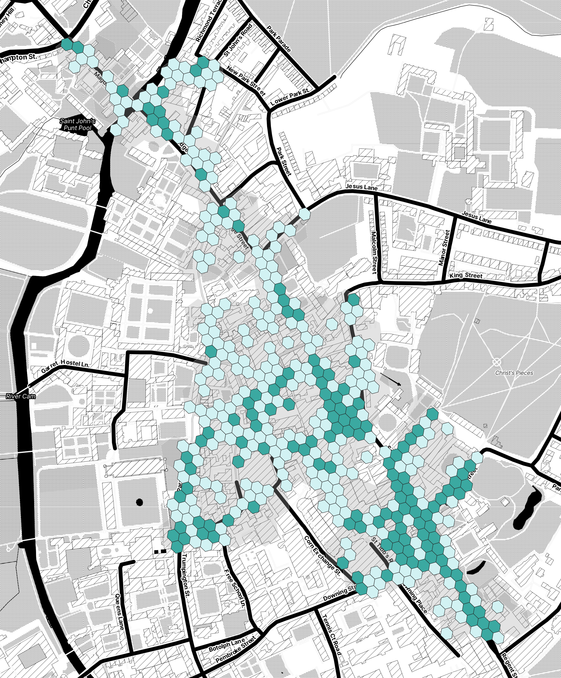
A very common type of location data visualisation is a heatmap.
Heatmaps show location trends utilising colour gradients and makes it easy to identify groups of data which correlate to one another.
A city planner could use a heatmap to identify busy or congested areas in their city which would help future decision making.
The Importance Of Data Veracity, Accuracy & Precision
Data can only ever be as useful as its veracity. If data is unreliable and inaccurate than any conclusions drawn, patterns recognised or stories deduced will be ineffective at best.
Decisions made using inaccurate data will be inaccurate themselves and will inform decisions based on misleading and false data.
This is why it’s vitally important to establish the veracity of data, especially when using it to make big decisions.
What Is Data Veracity?
So, what do we actually mean by data veracity?
In short, veracity is how accurate or truthful a data set is considered to be.
This relates to both the quality of the actual data as well as how reliable it is. When considering the reliability of data we have to acknowledge a few different things.
For instance, what’s the source of the data? What is the type of data? How has it been processed? Have abnormalities, inconsistencies and biases been accounted for or removed successfully?
It’s vitally important to understand these issues and to be able to identify the answers to these questions when utilising data.
As soon as there are question marks over any of these things it will affect its usefulness and reliability in decision making.
However that’s not the only element of data veracity you need to be aware of.
The other element to consider in determining mobility data veracity is stability. Stability is the extent to which the underlying building blocks of the data – often the data sources – change over time.
This is important as when mobility data is used to make decisions based on how trends or patterns change with time, the statistics need to be comparable on a like for like basis.
For example, you could use mobility data to find out how popular a certain supermarket was two years ago, and compare it to how popular it is today.
The whole series may be represented using a line or time-series chart, but if the data from two years ago was sourced using the CCTV people counting method and today it’s based in WiFi, it’s very difficult to compare the two levels like for like.
The final aspect of data veracity that you need to be aware of is how relevant or suitable the data is to answering your specific business question.
Take time to ask questions and understand the data fully, then ask yourself are these data points really representative of the activity you need to measure to answer your challenge.
If not, then consider not using it, or combining it with other research or data to create a more accurate picture.
Why is Data Veracity Important?
Data veracity is very important, and is considered one of the big 4 V’s in big data alongside Velocity, Volume and Variety.
As important decision making can be based on what patterns and insights data is providing, if that data is inaccurate, unreliable or unsuitable it will ultimately lead to poor decision making which could have real business consequences.
Before using data to make decisions you need to ensure that the data has been validated, standardised and in many cases normalised to be able to use it to inform other research.
However, this can be a lengthy and involved process which businesses can be all too ready to avoid due to time commitments and the specialist expertise required.
But don’t let that hold you back! Mobility data is an incredibly broad and powerful resource that can deliver extremely valuable outcomes for your business.
We would highly recommend that you partner or use data from providers like Huq Industries who always spend time to determine the veracity of our data and that it is accurate, reliable and immediately actionable.
How Can We Measure Data Veracity?
When looking at two mobility datasets side by side it’s hard to evaluate the differences. They could both have a column for the date, perhaps a category, place or thing – and then a number.
But hang on – those numbers are different! Which one is right? It’s important to evaluate the veracity of any data you use to make decisions on, before you take any action on that basis.
Using the wrong information can lead to costly and embarrassing mistakes. Here’s what you can do to avoid that situation.
1. Compare the data
You can almost always find an equivalent dataset somewhere that you can use to compare your mobility data with.
There are numerous great sources of open data out there. Very often the central statistics bureau for the country that you are working on, like the Office For National Statistics (ONS) in the UK, will have detailed, high-quality resources that you can download.
There are also plenty of other open access libraries to explore – such as Kaggle.com and Google BigQuery’s public datasets.
The data won’t be an exact match – otherwise why would you need a commercial source! – but it should be close enough to offer a legitimate benchmark.
Typical differences you might find are that (a) it’s old and only covers up to [ last year ], (b) it’s not as frequent and provides only quarterly rather than daily intervals, (c ) it covers a broader geographic area such as the town or country rather than the retail centre you’re researching, or (d) due to the data sources used and how the data is prepared the metric in fact reflects something slightly different.
But in all cases it should be possible to aggregate or summarise the mobility data you’re testing at the same level as the authoritative dataset you’re testing against so that any comparison can be reasonably like-for-like.
So, once you’ve got two comparable series, how can you objectively and statistically measure their similarities?
2. Calculate the Pearson Correlation
The most common method used to measure the extent to which two datasets are similar is to calculate the Pearson Correlation coefficient.
This is an oversimplification for sure, but imagine for example that you have two lines on the same chart showing the number of [ train trips ] made by people in one country over time.
They both go up and down according to days of the week and seasons – but there are clear differences between them.
The Pearson Correlation function considers both the direction (up or down) and the angle of change between intervals (the steepness) to provide a number that describes how in-line they are with each other.
The Pearson Correlation value ranges from -1 (they’re a mirror image) through 0 (they have absolutely no resemblance to each other) to 1 (they’re a perfect match). In most cases, if you trust the data you’re comparing your mobility data to then you’re looking for a number as close to 1 as possible.
Most data processing tools available will have the Pearson Correlation function built in so you don’t have to write it from scratch. In Excel or Google Sheets for example, the function is simply =CORREL(series 1, series 2).
But the Pearson Correlation function does not tell you how far apart the two series are on the Y axis!
3. Calculate the Mean Absolute Percentage Error (MAPE)
What is the Mean Absolute Percentage Error?
The Mean Absolute Percentage Error (or MAPE for short) is a figure that is often used to describe how far apart two lines or series are from each other on the Y Axis.
This is important if both datasets that you are comparing express figures in actual terms, for example the actual number of train journeys made, or the actual revenues of a business.
Both datasets could be identical from a ‘shape’ perspective (see the Pearson Correlation discussion above), but if one says that 100 train journeys were made and the other says 100,000 train journeys were made on the same day then you’ve got a problem!
If the datasets that you are comparing are both indexed to the same point in time, then they will both start at your reference number (often 100) and simply show how they deviate from that point over time.
If that is the case, you won’t need to worry about calculating the Mean Absolute Percentage Error.
The Mean Absolute Percentage Error calculates the difference (whether it’s positive or negative) between each of the values at the same intervals (ie. day) and averages the result to provide a view of how far apart the two lines are over their whole series.
Most businesses that take data validation very seriously (as everybody should) will be looking for a high Pearson Correlation score and a low MAPE to determine that the test dataset is a good match with the authoritative equivalent.
4. Ask the vendor
Taking steps to validate new data using the Pearson Correlation and MAPE combination of methods is commendable and we would encourage everybody to do it.
But in reality not all companies have the time or resources to carry it out.
Any high-quality mobility data provider that cares about the veracity of its data should be continually verifying its data in this way or equivalent, and should be able to readily provide its testing results in an open and transparent way.
Often the simplest thing to do is just ask them! It’ll tell you a lot about each vendor’s approach to data quality and veracity.
Ten Tools To Amp Mobility Visualisation & Presentation
It’s not just enough to have acres and acres of data, you need to be able to visualise and represent it coherently and powerfully (as outlined in chapter eight) to get the full benefits.
To make this easier there are a plethora of different data visualisation and presentation tools available.
To help get you started we’re sharing a list of our top ten tools for visualising and presenting data.
By visualising and presenting your mobility data well you stand a much greater chance of getting stakeholder buy-in and interest in the goal you’re trying to achieve by utilising mobility data.
1. Google Data Studio
Google Data Studio is a great free online tool which allows the user to create customised and informative reports and dashboards.
It was first introduced back in March 2016 as an enterprise solution with a free version rolled out later that year in May.
You can use Google Data Studio to visualise data with highly configurable charts and tables which you can then use to tell different stories with your data.
You can easily connect different data sources as well as share and collaborate with other users or colleagues.
Data Studio includes all the usual visualisation charts you might expect like line, bar, column, pie, tables and indicators and has easy to use filters and date range controls.
You can enhance the style of your reports too with colours, typography and imagery.
Programming knowledge isn’t required but you can connect databases such as BigQuery, MySQL and PostgreSQL as well as blending data from different sources.
2. Kepler
Kepler is a powerful open source geospatial analysis tool for large scale data sets.
It’s a web based platformed which provides visualisation for large scale location data and has been created and open-sourced by the visualisation team at Uber.
It was created to provide an industry-grade open source framework and is great for exploratory data analysis.
However the main drawback of Kepler is that all the processing needs to be done outside of Kepler and that it is a desktop tool that only takes data from CSV and JSON.
This means it can be quite a painful and arduous task when dealing with large amounts of data whereby you need to keep downloading CSV files to plot onto the tool.
Generally speaking Kepler is targeted at business users who don’t possess the requisite skills for coding or SQL.
That said, there has been a relatively large uptake amongst data scientists across Google and AirBnB for visualisation.
3. Mapbox
Mapbox provides maps and locations for developers and can utilise precise location data.
Mapbox provides developers with access to comprehensive location information and the ability to create and customise dynamic or static maps using Mapbox tilesets.
These styled maps can then be embedded into web applications.
They provide a generous free tier in their pricing packages which is an ideal solution for businesses with low volumes of users.
You can get access to well organised documentation to a tool which is easy to integrate with applications, however, there is a relatively steep learning curve.
Mapbox is currently used by Snap, Shopify & Meta (formerly Facebook).
4. Carto
Carto is an open source location intelligence SaaS platform built on PostGIS and PostgreSQP and was formerly known as CartoDB.
Carto provides users with GIS, web mapping and spatial data science tools and has a wide scope of use cases thanks to its horizontal visualisation and analysis capabilities.
It also incorporates a host of different filters and widgets to better analyse and visualise data.
There are, however, a couple of downsides. Similar to Kepler, all pre-processing needs to happen outside of the system, especially when dealing with complicated data sets. Also data analysis can only be carried out on one data set at a time.
Carto is positioned as a location intelligence platform with an aptitude for both data analysis and visualisation that doesn’t require any former GIS or development experience and comes complete with a UI tailored toward modern web developers and data scientists.
5. Microsoft Power BI
Microsoft Power BI is an ideal data visualisation solution for existing Microsoft environments.
It’s a powerful analytics and data visualisation tool which can pull information from multiple sources and place them into interactive dashboards.
Microsoft Power BI is a great tool for businesses looking for reports of KPIs and key metrics and is adept at taking complex data and converting it into easy to understand charts and infographics.
The main advantages are the ease in which you can take data from multiple sources and combine into one report all within the cloud.
6. Tableau
Tableau is a visual analytics platform which excels at compiling data from multiple sources such as machine learning, artificial intelligence and business intelligence.
It has a very friendly and easy to use interface for data visualisation and is very accessible for businesses.
Tableau integrates with approximately 250 different apps which includes the popular CRM Salesforce.
There’s also a more budget friendly option for smaller businesses called Tableau Public which provides free data visualisation.
7. Maptive
Maptive is a yet another great cloud based tool for mobility data visualisation and analysis.
It is a sophisticated piece of software which allows users to upload spreadsheet data which is then instantly plot onto a map.
From there you can use visualisation techniques such as heat maps, cluster maps and drive-time radii to unearth key insights which can enhance decision making.
As a cloud based tool, collaboration and sharing is easy to do.
8. Someka Heat Maps
Someka Heat Maps is a popular heat map specific solution which allows users to generate effective and insightful heat maps within Microsoft Excel.
You simply import your data and it automatically generates your heat map, using automated colouring to distinguish different geographical units.
As Someka uses Excel its very simple and practical to use and is an effective solution of generating heat maps.
9. Google Maps API
Google Maps API is the most popular tool out there for embedding maps into applications.
As a Google product is has a massive database of places and strong routing functionality.
It incorporates all the features of Google Maps such as geocoding, routing, pictures, street view and places information which combined with its ability to customise the appearance of maps makes it a very powerful and useful tool.
Usage is free, however you will need to pay if you want to display places, details or directions.
As mentioned, the huge upside is the vast database which you would expect to find with any Google product.
However, there are a few downsides to consider.
It is very heavy to render and drains battery rather quickly. The markers and shapes are also 100% static and as a non-open source product routing functionality is expensive.
It’s currently used by Uber, Bolt and Trip Advisor amongst many, many others.
10. OpenStreetMap API
OpenStreetMap API is often spoken about as an alternative to Mapbox.
It’s an open source solution which is contributed to by a dedicated team of volunteers who create routes, imagery and other data for the map.
The service and map is available to the public, however, you can’t use the API to retrieve real time routing for commercial apps and is limited to provide vector data for solely map editing purposes.
Due to these limitations, invariably users will still need to turn to services like Mapbox and has overall limited usage as routing, map clustering etc. are dependent on 3rd party APIs.
It also has incomplete documentation.
In Summary
There are many data visualisation tools out there to choose from – some of them paid for, and some of them free.
Furthermore, some tools are specially adapted for visualising cartographic or geospatial information.
Others provide a solid means to display and interact with conventional statistical visualisations.
Funnily enough, even though mobility data provides insights into real things happening in the real world and you would assume that maps are the natural place to show it, the fact about this data is that it’s statistical.
And therefore, very often the clearest and most effective way to show mobility trends and insights is by using standard conventions such as line charts, histograms and others.
But for non-statistical data, such as diffusion heatmaps, map-based visualisations will be the only way.
These visualisation tools are not in themselves mobility data; they are simply the software that enables users to visualise and understand mobility data.
Such platforms increasingly offer free or commercial datasets for users to draw on but that data is always sourced from third parties.
Where data visualisation tools are the car, mobility data is the fuel, and you’ll always need both to drive it!
Conclusion
So there we have it.
Our deep diving into all things mobility data. You should now have a pretty good understanding of all that mobility data entails.
We’ve explained what it is, how it’s collected and how organisations can use it to improve their decision making.
Furthermore we’ve shared with you some great ways to visualise your mobility data and our favourite tools which can help achieve this.
This Ultimate Guide to Mobility Data will continue to expand and grow over time, so please check back later to get all the latest information!