FAQs & Support Documentation
Introduction to Huq and the Customer Success Team
Welcome to Huq! Your Customer Success Team at Huq are here to make sure you maximise the value of our partnership by achieving your agreed business outcomes with geo-location data.
Your Customer Success Manager can be reached directly or contact the whole team at [email protected].
Contents
| Theme | Topic |
|---|---|
| Collection | How does Huq collect its data? |
| Collection | What data does Huq collect? |
| Collection | What’s Huq’s data collection methodology? |
| Huq Insights | Footfall |
| Huq Insights | Density |
| Huq Insights | Dwell |
| Huq Insights | Average Dwell (Weekday) |
| Huq Insights | Granular Catchment |
| Huq Insights | Visit Frequency |
| Huq Insights | Demographics |
| Huq Insights | Day-part |
| Verification | How does Huq verify its data for accuracy? |
Introduction to Geo-Location Data
How do we collect our data?
At Huq, we have direct relationships with our app publishers whereby we collect aggregated and anonymised data through our proprietary Software Development Kit (SDK).
With the appropriate user permissions, our software runs in the background of popular mobile apps to collect data. Importantly, we do not collect any identifiable information. Our partner apps are required by us to employ strict privacy measures and are subject to regular privacy audits. At a minimum, we require the provision of clear, intelligible disclosures and consent requests to users. This effort is aided by strict Google Play and Apple Appstore regulations on publishers wishing to collect consent and permissions for specific data access. This allows us to be confident that the data we collect is compliant, accurate and of high quality.
What data do we collect?
We collect information from those who have downloaded one of our partner apps and explicitly consent to the collection and sharing of their data. To create our products we collect a limited number of statistics and measurements that typically fall into two categories: device information and location data.
Huq’s Data Collection Methodology
It’s important to remember that with our methodology, in the underlying data, we are monitoring a subsection of the population. This data is then processed against the number of observed devices we collect to reflect an estimate of actual footfall for a given day.
To position your baseline level of data (and adjust for regional bias), we will analyse the home location of each device in your boundary, the coverage of the population we have at the home location for each device (i.e. how many people that device represents in that area) and identify the volume of visitors for each device according to their home location. This methodology ensures we yield dynamic results over time that reflect representation according to the home location of each visitor.
Overall, due to our data collection methodology, when we view trends in the data across long periods the data is very statistically robust, essentially there is a high level of confidence in whether the footfall is trending upwards or downwards over time and how this fluctuates. Random behaviour or isolated shifts in our panel size on individual days will not have a big impact on overall trends unless it is a continuous pattern of behaviour, in which case it will become a trend and impact the overall trend-line.
Huq Insights
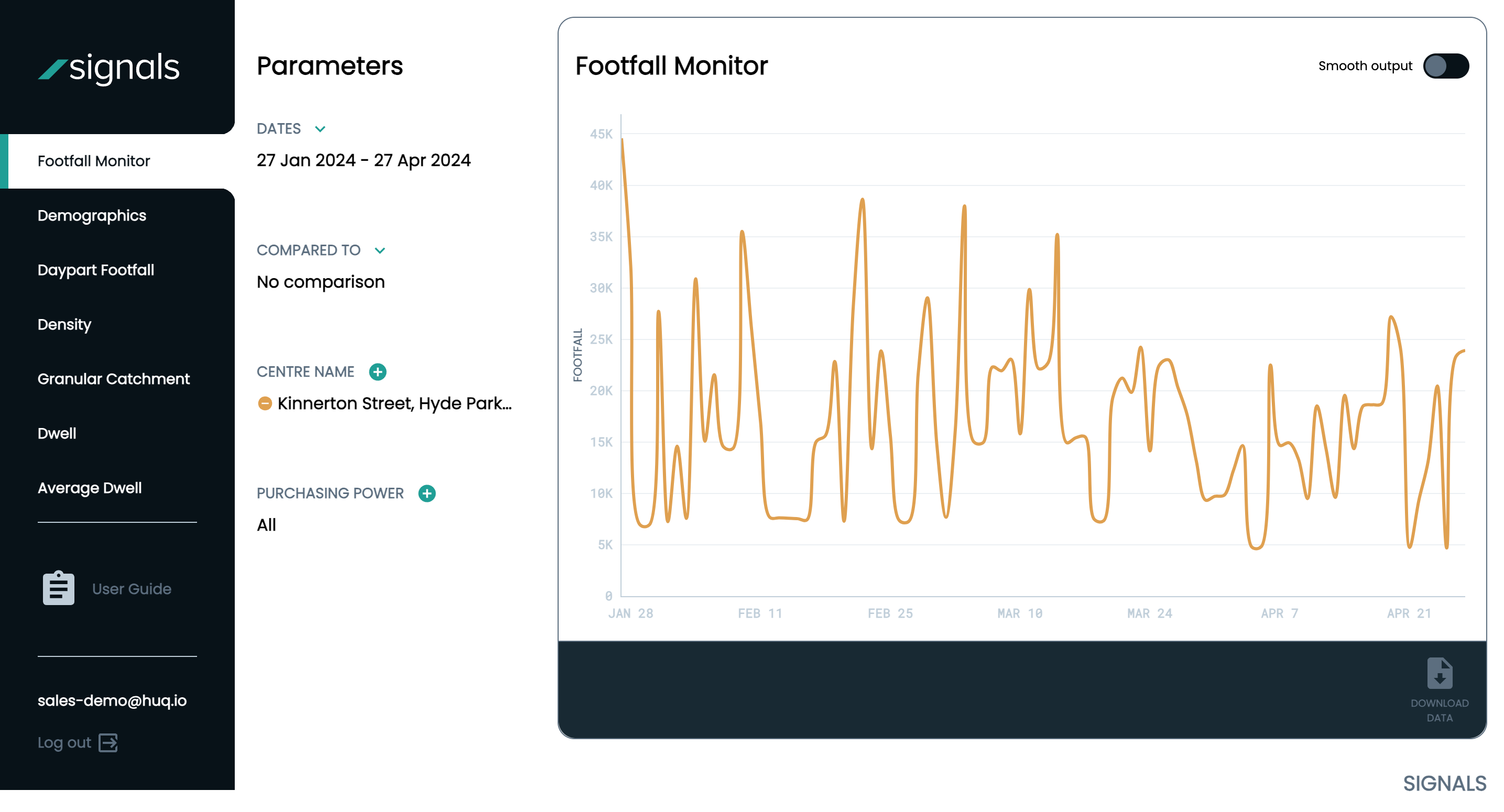
Footfall
When we measure footfall, we are measuring the number of unique people observed within an area on a day. Therefore, if a person were to exit and re-enter your area on the same day, they would only be counted once.
In addition, we are able to isolate elements of the observed footfall within an area, for example, home residents, to ensure we meet a stricter definition of footfall. It is also important to consider that we are unable to administer a systematic removal of all traffic data. However, we do exclude a large number of driving and transport apps which could distort a signal.
Within your Signals dashboard, you can compare any number of locations which you’re subscribed to at one point, giving a comprehensive view of your chosen landscape. There are two ways to visualise footfall in your dashboard:
1. Estimated Actual Footfall -The Estimated Actual figure represents the number of visitors we believe to have observed in your area for a given day. As our data is derived from a panel that is representative of the population, it is most valuable to report trends over longer periods of time.
2. Estimated Rolling Footfall -The Estimated Rolling figure is the average number of visitors we believe to have observed in your area for a given day. This is visualised as a weekly cadence. For example, the figure for a chosen day will be an average of the previous 6 values for the same day of the week. This visualisation gives a smoother version of footfall trends over time.
Time period Comparisons
Within your dashboard, you can compare the performance of your location with previous time periods to understand more about how your footfall changes over time.
We have pre-selected shortcuts for comparison modes (month, quarter, year) and you can also select your own. Please note that the comparison mode selected is big enough to accommodate the originally chosen date range.
Once chosen, the bold line in your graph will be your original selected time period, and the faded line will be your comparative period. Where the range is suitable, the graph will populate the percentage changes against the time comparisons underneath your graph.
Please note, there is a 2-3 day time lag to the data updating in your platform. Recommended Parameters: Minimum one month.
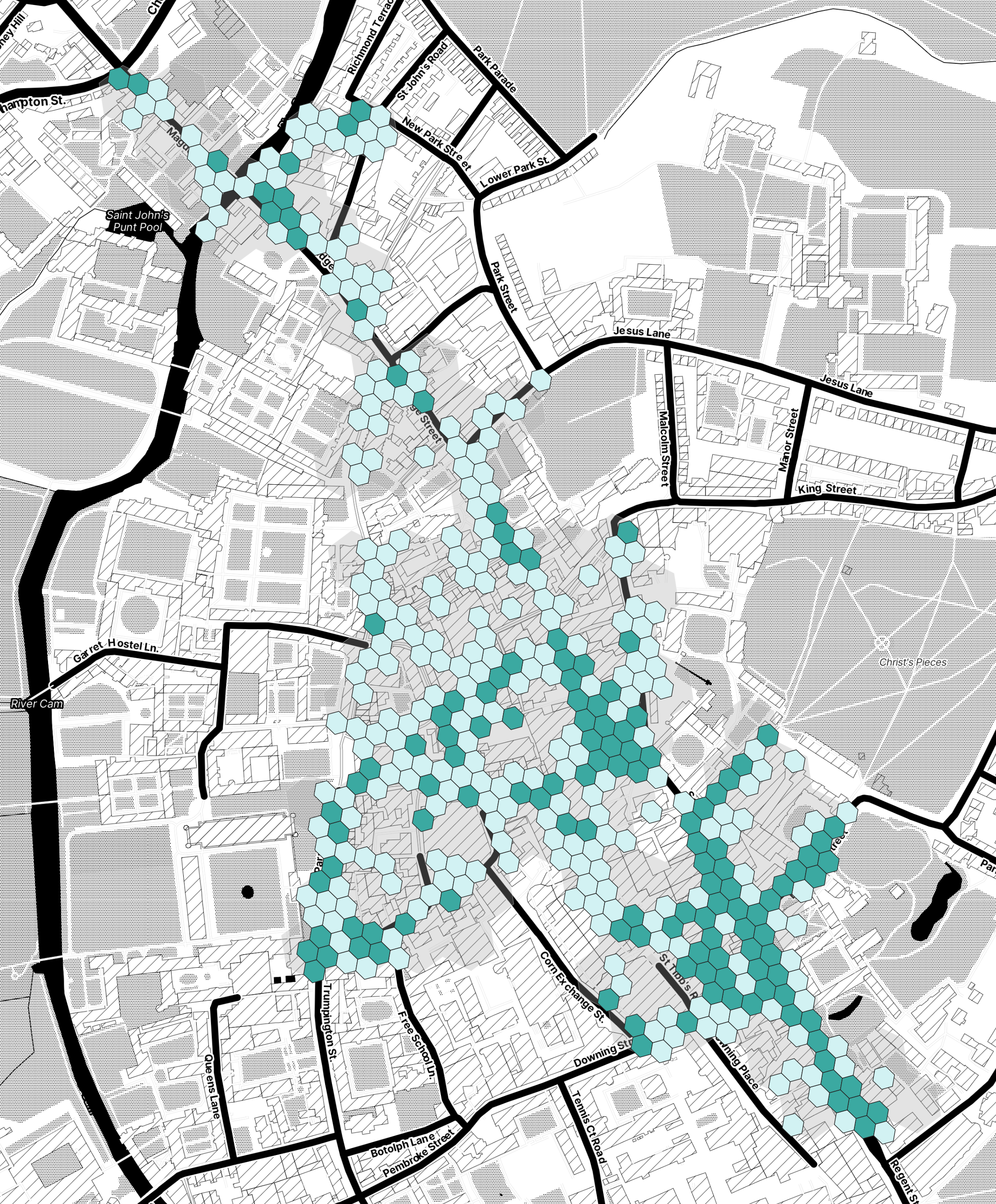
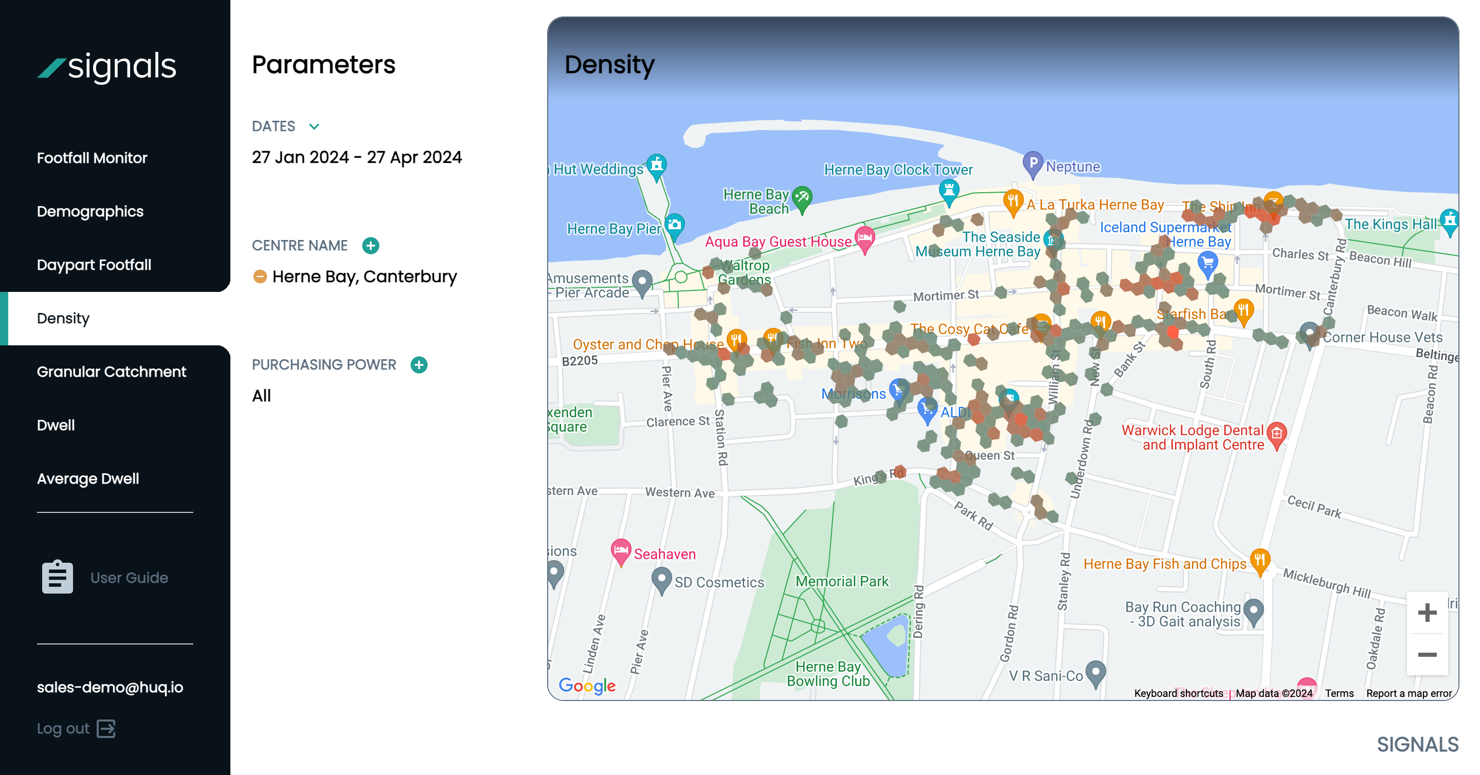
Density
The Density module enables you to look at the locations that users visit in more detail. The more devices that visit a particular point on the map, the greater the density that will be visualised at that point.
This calculation works on a relative scale (between 0-1), therefore an area with a value of 1 is two times more densely populated than an area of 0.5.
The range used to calculate Density will always be relative, which means that a ‘1’ in Location A area will be different to a ‘1’ in Location B.
The colour scheme aligns with the scale in that those hexagons closer to 0 will be green, 0.5 orange, and those closer to 1 will be red. A hexagon is triggered by a single device visiting that area at any given hour.
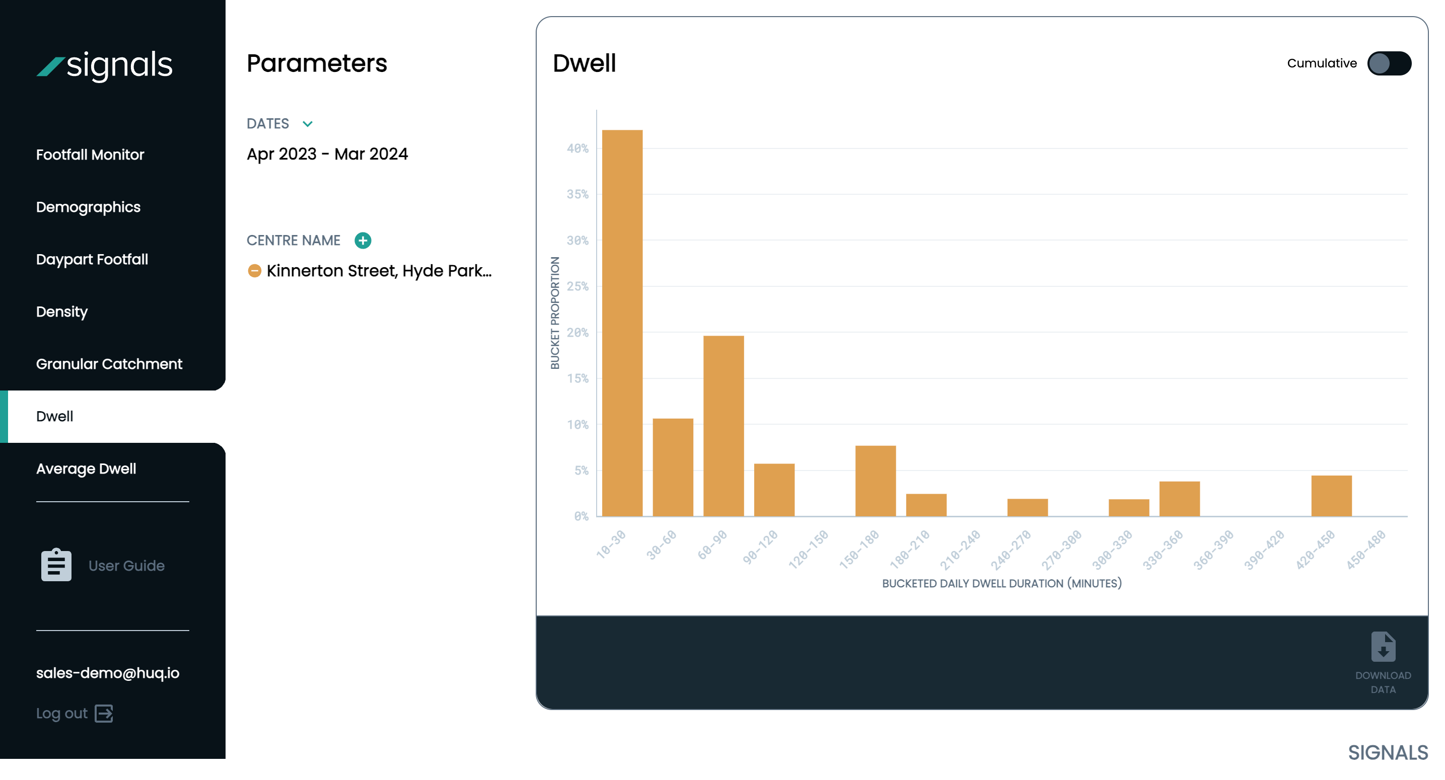
Dwell
The Dwell metric allows you to understand how long visitors are spending in your area, broken down into several time buckets. This allows you to understand what percentage of your visitors are spending 10-30 minutes in your area, compared with those spending 120-15 minutes for example.
This is intended to to help you understand or infer what the motivation or purpose might be for your visitors.
Recommended Parameters: Minimum one month
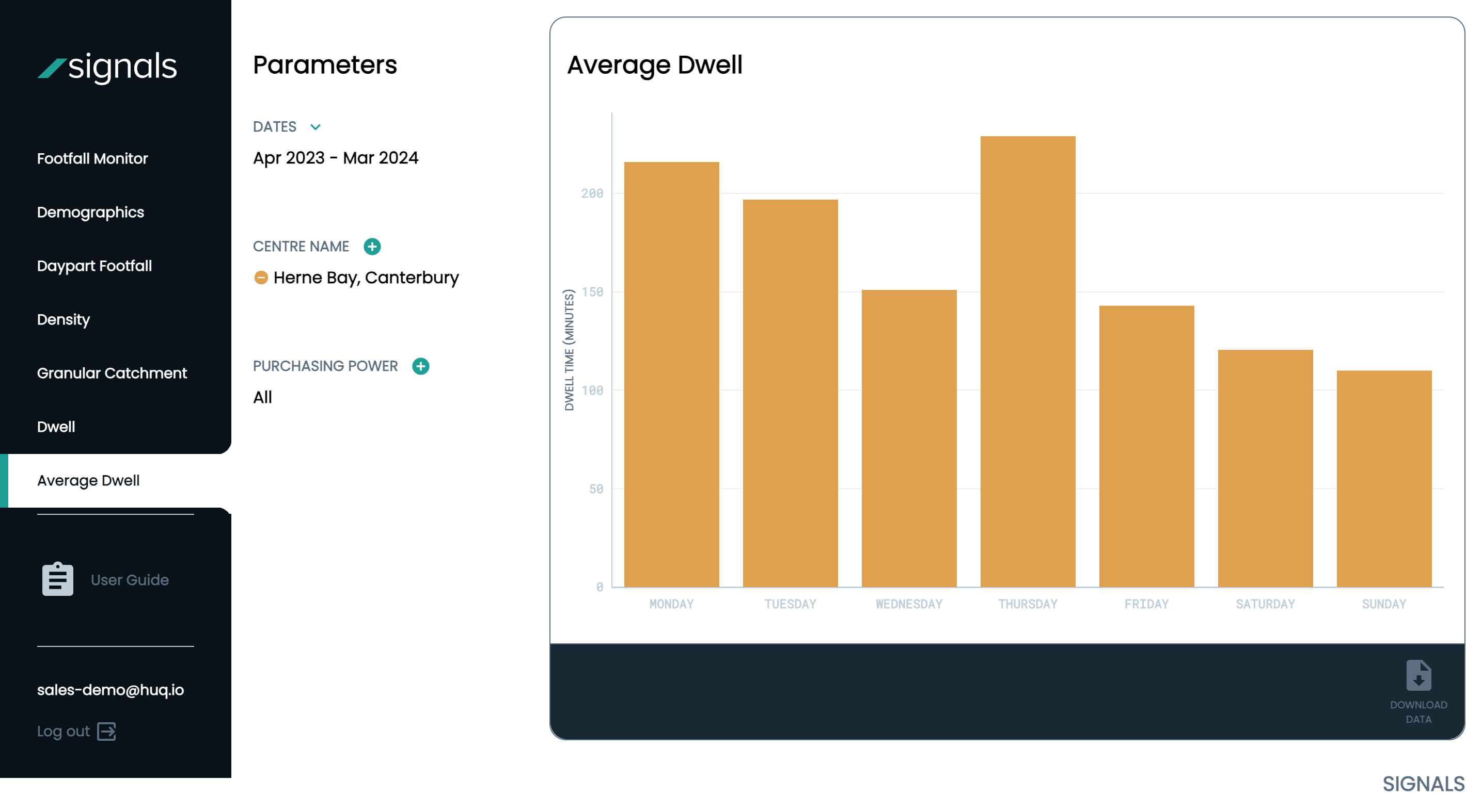
Average Dwell
The Average Dwell metric is similar in you can understand how long visitors are spending in your area. However, this time you are looking at the average number of minutes people are spending in your area across each day of the week. Recommended Parameters: Minimum one month
Granular Catchment
When we are measuring Granular Catchment, we are analysing where the visitors to an area live at a postcode district level.
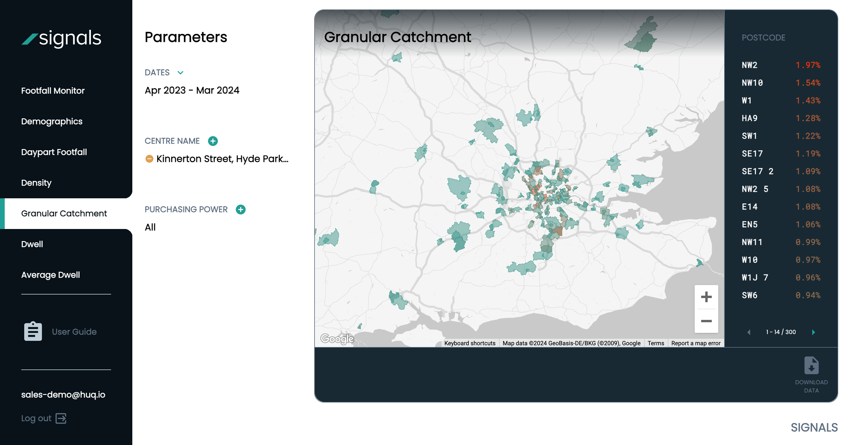
In order to calculate each visitors home location, we will analyse where each device has resided over night the most in a 30 day period, and assign that location as the devices home location. The percentage against postcode district represents what share of the total unique visitors come from that particular postcode.
The higher percentages are coloured red and proceed through to amber and green, which denotes a lower share. Please note that unshaded areas do not mean that no visitors came from those area. Instead it means that the volumes are below Huq’s minimum reporting threshold.
Recommended Parameters: Minimum one month
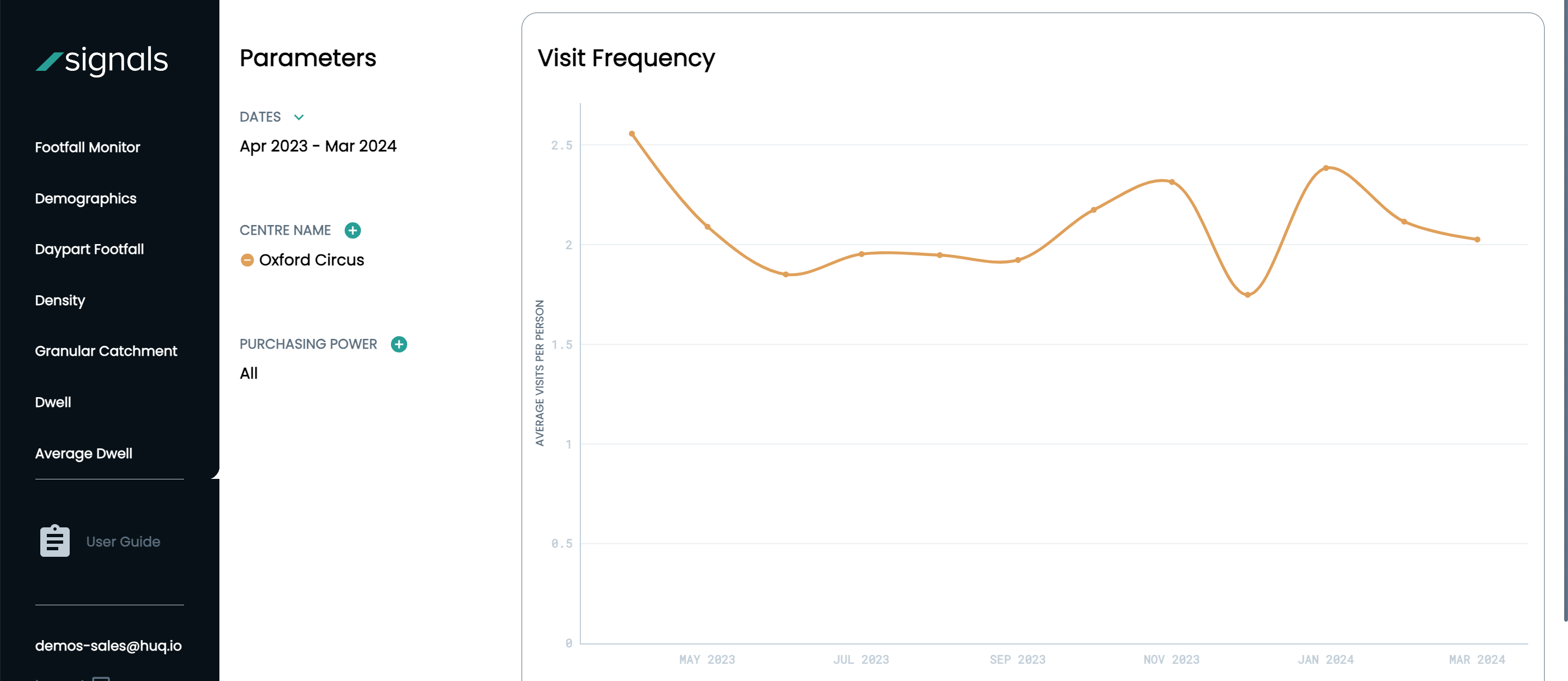
Visit Frequency
The Visit Frequency insight allows you to see how often unique visitors return to your area on a monthly basis. The methodology works by counting the number of different days on which a unique visitor is observed within your area over a month, and is then summarised across all unique visitors using the mean average. Therefore, the correct way to read the Vist Frequency graph is that “on average, visitors to this area returned X times during [the month].” Recommended Parameters: Minimum one month
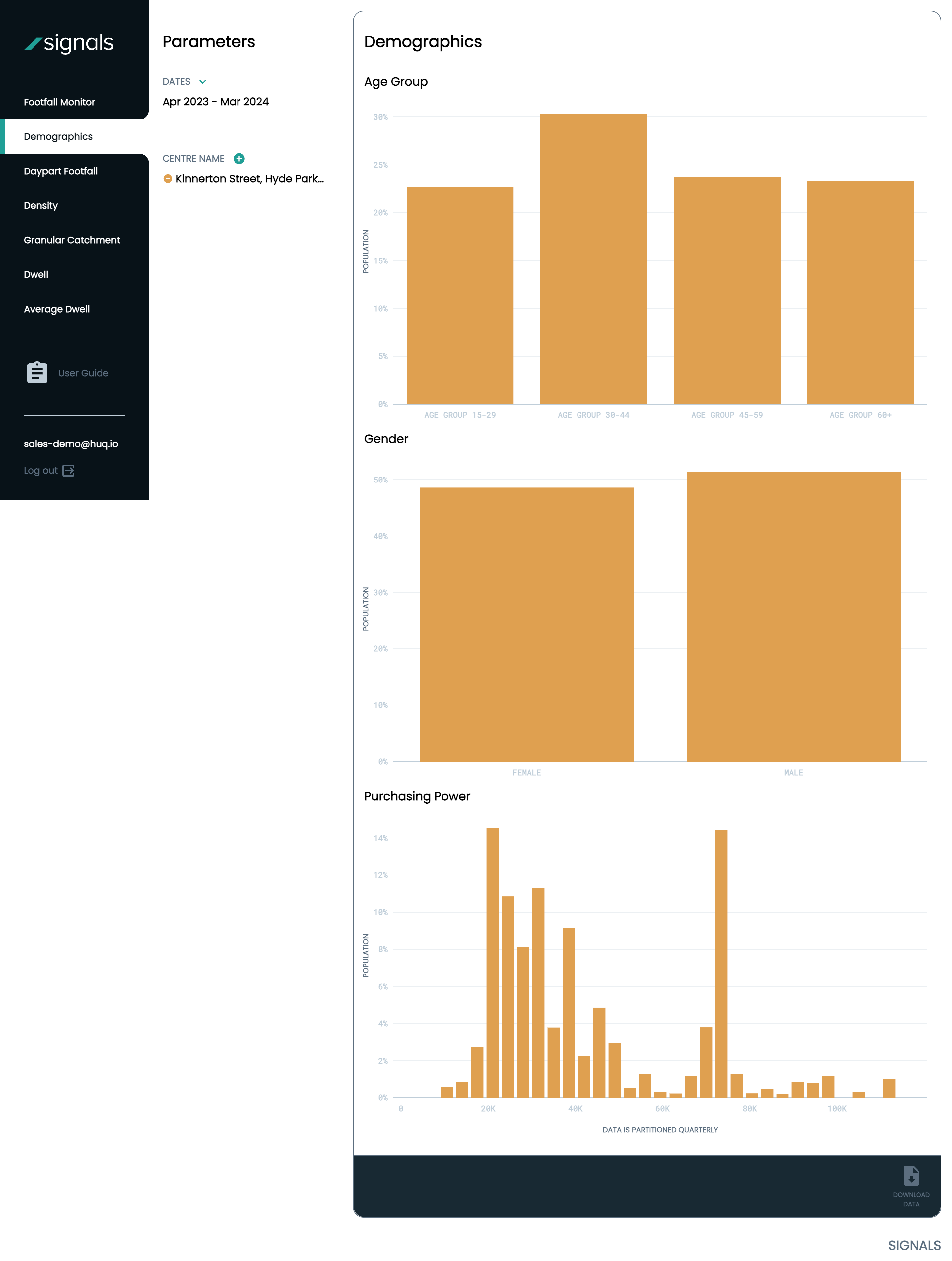
Demographics
The demographic data of your visitors consists of three key metrics; Age Group, Gender & Purchasing Power. Huq’s Age Group , Income and Gender information is collected via Census.
Purchasing Power
The Purchasing Power metric is comprised of income data, derived from the census which can then be associated to a device via it’s known home location. Purchasing Power also incorporates housing prices and the cost of living in the home location of visitors. We believe this gives a comprehensive signal to the ‘purchasing power’ of a visitor.
.
For example, a visitor living in London may earn a higher wage, however, the cost of living is also higher, therefore the purchasing power metric will be able to accommodate for disposable income considerations.
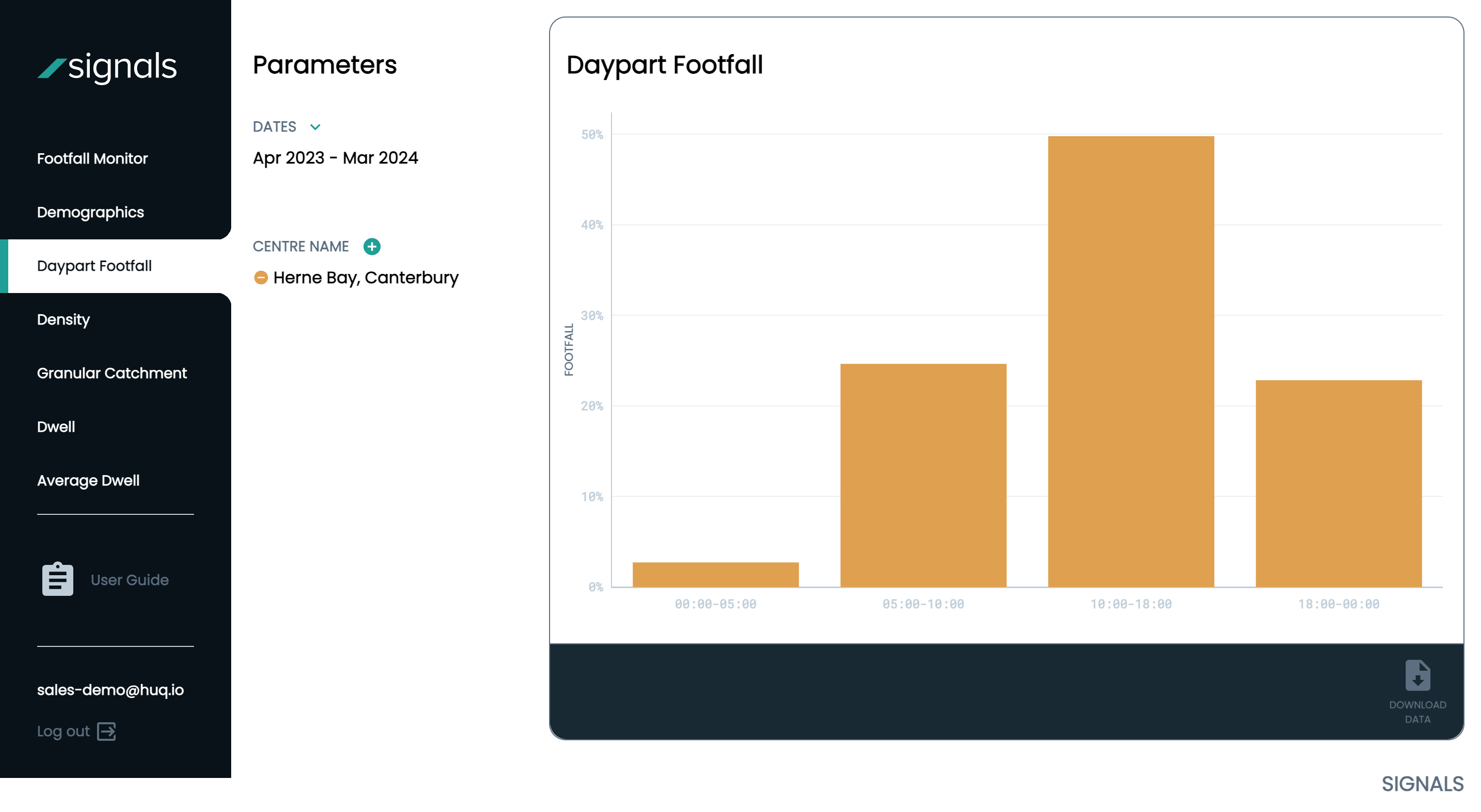
Daypart
The Daypart footfall analysis allows you to understand how your footfall levels are broken up across a 24 hour period.
How Does Huq Verify its Data Accuracy?
We carry out extensive reviews of our data quality and compare it continually against external sources and ‘known truths’ in order to ensure that our methodology is providing accurate outputs.
However, it is important to consider that there is no definitive method for measuring the entire population of any given area, and there are caveats and drawbacks to every footfall or comparison dataset that you come across.
Please see below a handful of methods we have taken to verify our data:
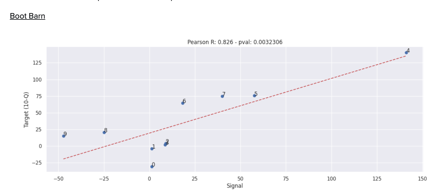
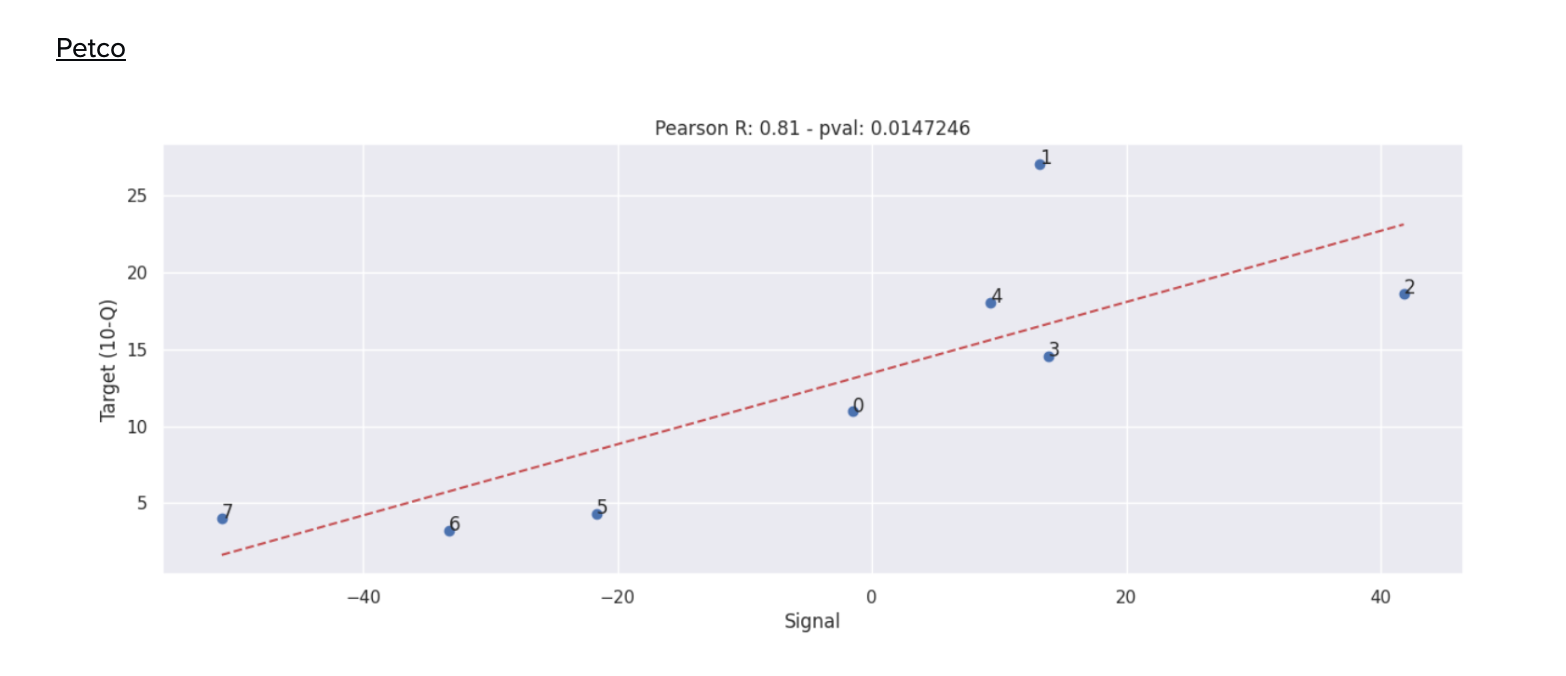
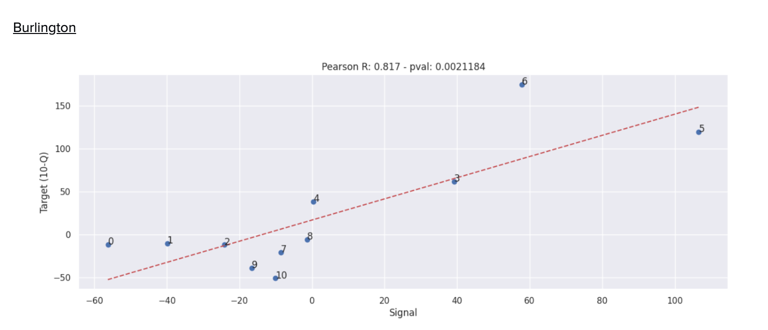
US Big Box Retailer Data
Tthe below graphs illustrate a Pearson coefficient of more than 0.8 against Signals data and retail sales. (i.e. 80%+ correlation)
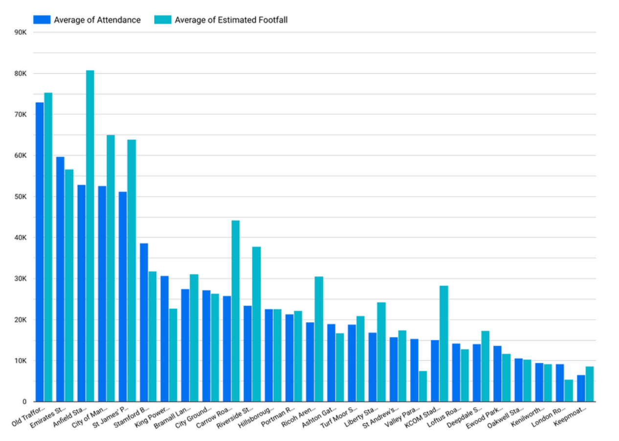
Football Stadium Attendance
Evaluating Signals data against recorded attendance. The below graph illustrates this comparison:
Academic Validation
Testing of our underlying data by the UBDC/University of Glasgow to confirm the data is representative at a population coverage level. Below is an excerpt from that study: